Show code
library(dplyr)
library(purrr)
library(ggplot2)
library(tidyr)
library(knitr)
library(tibble)
library(quantmod)
library(PerformanceAnalytics)
library(nortest)
library(latex2exp)
library(fitdistrplus)
library(tidyquant)
library(kableExtra)We use cookies
We use cookies and other tracking technologies to improve your browsing experience on our website, to show you personalized content and targeted ads, to analyze our website traffic, and to understand where our visitors are coming from.
In a previous post, we explored various techniques for visualizing financial data, specifically asset returns, using R and a range of graphical tools. We focused on visual tools such as line charts, histograms, and density plots, all of which provide valuable insights into the distribution of asset returns. However, a more fundamental question remains:
How can we quantify the uncertainty and make probabilistic inferences associated with these asset returns?
This is a crucial step since non-technical stakeholders often require more than visual insights. They need rigorous, data-driven estimates to make informed decisions, particularly when it comes to understanding risk and uncertainty. Answering this challenge involves providing robust methods to model and quantify these uncertainties, bridging the gap between visualization and probabilistic estimation.
The following packages will be used in this post:
library(dplyr)
library(purrr)
library(ggplot2)
library(tidyr)
library(knitr)
library(tibble)
library(quantmod)
library(PerformanceAnalytics)
library(nortest)
library(latex2exp)
library(fitdistrplus)
library(tidyquant)
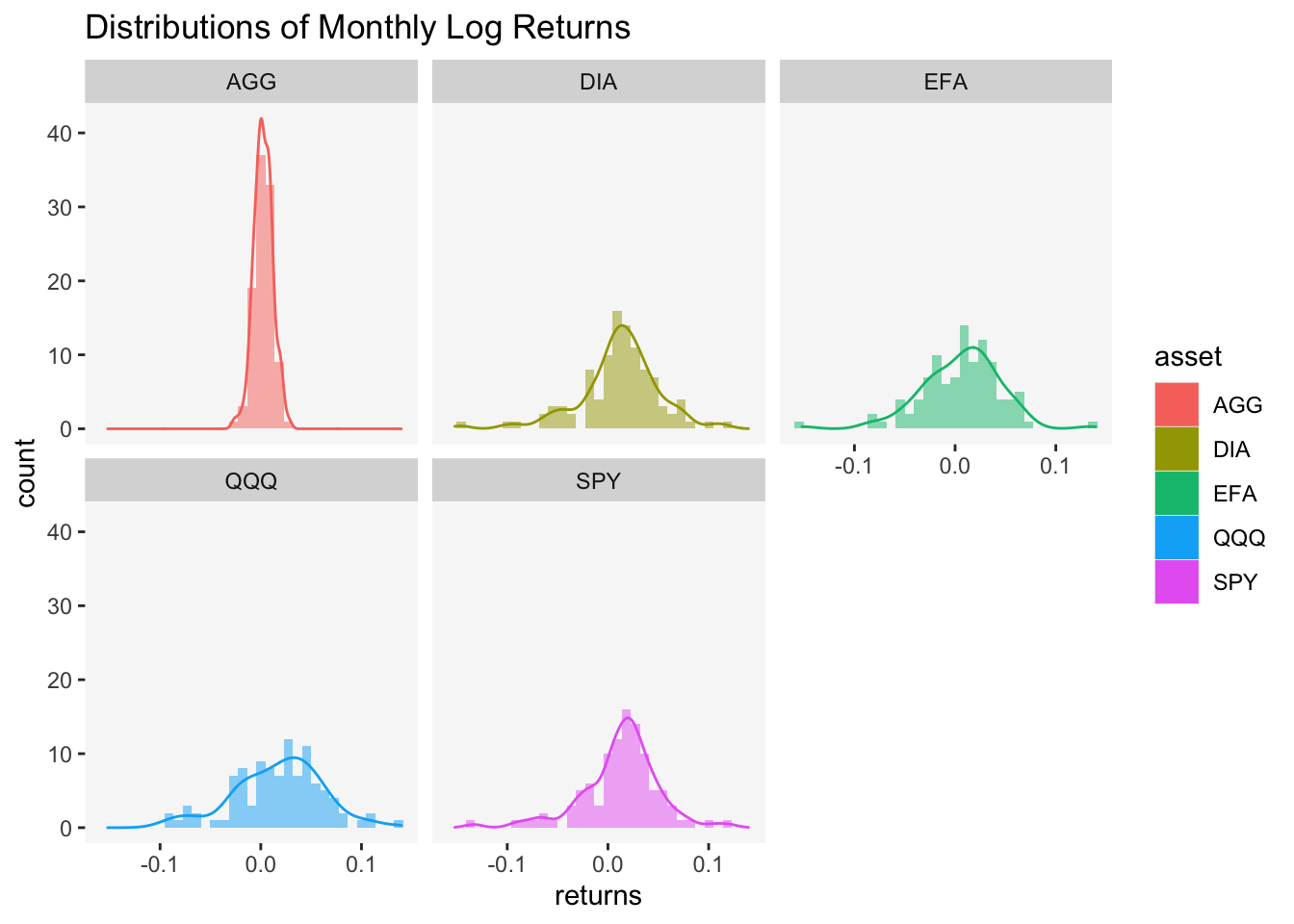
library(kableExtra)The last time we examined financial data, we focused on a class of assets called the Exchange Traded Funds (ETFs). We took a sample of daily prices from 2012-12-31 to 2021-7-31 and converted them to monthly log returns. This ultimately left us with a sample of 103 monthly log returns. The last section of previous my post on asset visualization ended with this following visualization:
We also established that the heights of the curve (the y-axis) do not represent probabilities directly. To obtain actual probabilities, we need to calculate the area under the curve over a specified range of returns. This process involves integrating the probability density functions (PDF) over the interval of interest, which gives the probability that the asset returns fall within that range. However, financial data often exhibit characteristics—such as fat tails, skewness, or volatility clustering—that make it difficult to consistently fit a single distribution adequately. The problem, as David Harper once described in a blog post, is precisely this:
Finance, a social science, is not as clean as physical sciences. Gravity, for example, has an elegant formula that we can depend on, time and again. Financial asset returns, on the other hand, cannot be replicated so consistently. A staggering amount of money has been lost over the years by clever people who confused the accurate distributions (i.e., as if derived from physical sciences) with the messy, unreliable approximations that try to depict financial returns. In finance, probability distributions are little more than crude pictorial representations.
I cite Harper here to underscore just how challenging it is to accurately and consistently capture uncertainty in finance. Yet, while this difficulty is real, it’s not a reason to abandon the task altogether. On the contrary, I believe we should not dismiss the valuable insights provided by mathematical and statistical models. Why? Because, as the saying goes:
“All models are wrong, but some are useful.”
In finance, where uncertainty reigns, having some insight—however imperfect—can still be far more valuable than having none. In this spirit, let’s take up the challenge we posed in my previous post and work through it to the best of our abilities, recognizing the limitations our these approaches while still seeking actionable understanding.
A common practice is to approximate returns data using the normal distribution. However, empirical evidence often shows poor fit due to skewness and excess kurtosis. Let’s examine the skewness and excess kurtosis of our returns data:
symbols <- c("SPY", "EFA", "DIA", "QQQ", "AGG")

asset_log_returns <- tq_get(
  x = symbols,
  get = "stock.prices",
  from = "2012-12-31",
  to = "2021-7-31"
) %>%
  # The asset column is named symbol by default (see body(tidyquant::tq_get))
  group_by(symbol) %>%
  # Select adjusted daily prices
  tq_transmute(
    select = adjusted,
    col_rename = "returns",
    # This function is from quantmod
    mutate_fun = periodReturn,
    # These arguments are passed along to the mutate function quantmod::periodReturn
    period = "monthly",
    type = "log",
    # Do not return leading period data
    leading = FALSE,
    # This argument is passed along to xts::to.period, which is wrapped by quantmod::periodReturn
    # We use the last reading of each month to find percentage changes
    indexAt = "lastof"
  ) %>%
  rename(asset = symbol) %>%
  # Convert to wide so we can use purrr to apply skewness and kurtosis functions to each group
  pivot_wider(names_from = asset, values_from = returns) %>%
  dplyr::select(-date) %>%
  na.omit()

asset_log_returns |>
  head() |>
kable()| SPY | EFA | DIA | QQQ | AGG |
|---|---|---|---|---|
| 0.0499226 | 0.0366063 | 0.0593019 | 0.0263651 | -0.0062308 |
| 0.0126787 | -0.0129693 | 0.0159765 | 0.0034335 | 0.0058909 |
| 0.0372677 | 0.0129693 | 0.0373773 | 0.0297997 | 0.0009847 |
| 0.0190305 | 0.0489679 | 0.0193810 | 0.0250568 | 0.0096396 |
| 0.0233351 | -0.0306559 | 0.0234128 | 0.0351493 | -0.0202146 |
| -0.0134340 | -0.0271443 | -0.0149588 | -0.0242442 | -0.0157781 |
Histograms of Log Returns
asset_log_returns %>%
  # Gather the data into long format
  pivot_longer(cols = everything(), names_to = "asset", values_to = "returns") %>%
  # Plot the histograms with facet wrap
  ggplot2::ggplot(aes(x = returns)) +
  geom_histogram(bins = 30, fill = "blue", alpha = 0.5) +
  labs(
    title = "Monthly Log Returns",
    x = "Log Returns",
    y = "Frequency"
  ) +
  facet_wrap(~asset, scales = "free") + # Facet by asset
  theme_minimal()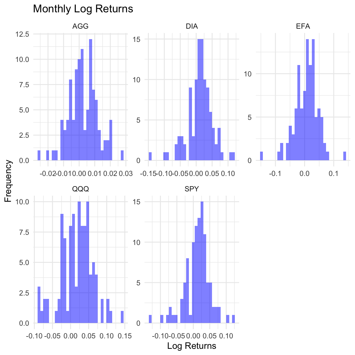
Skewness
# Skewness
asset_log_returns %>%
  # Apply the function from the PerformanceAnalytics package to each ETF
  purrr::map_dbl(
    .x = .,
    .f = PerformanceAnalytics::skewness,
    method = "moment"
  )
SPY EFA DIA QQQ AGG
-0.7011348 -0.5213105 -0.7557157 -0.2351335 -0.0665880 Excess Kurtosis
# Excess Kurtosis
asset_log_returns %>%
  # Apply the function from the PerformanceAnalytics package to each ETF
  map_dbl(
    .x = .,
    .f = PerformanceAnalytics::kurtosis,
    method = "excess"
  )
SPY EFA DIA QQQ AGG
2.1505599 2.1227673 2.3110373 0.3138144 0.3452098 In addition, take a look at the results for a test of normality:
| SPY | EFA | DIA | QQQ | AGG |
|---|---|---|---|---|
| 3e-04 | 0.0886 | 7e-04 | 0.129 | 0.6993 |
Controlling Type I error rate at
Auto-Correlation
acf_data <- asset_log_returns %>%
  pivot_longer(cols = everything(), names_to = "asset", values_to = "returns") %>%
  group_by(asset) %>%
  summarize(
    acf_results = list(acf(returns, plot = FALSE))
  ) %>%
  mutate(
    acf_vals = map(acf_results, ~ as.numeric(.x$acf))
  ) %>%
  dplyr::select(-acf_results) %>%
  unnest() %>%
  group_by(asset) %>%
  mutate(lag = row_number() - 1)

acf_ci_data <- asset_log_returns %>%
  pivot_longer(cols = everything(), names_to = "asset", values_to = "returns") %>%
  group_by(asset) %>%
  summarize(
    ci = qnorm((1 + 0.95) / 2) / sqrt(n())
  )

ggplot(
  data = acf_data,
  mapping = aes(x = lag, y = acf_vals)
) +
  geom_bar(stat = "identity", fill = "blue", alpha = 0.5) +
  geom_hline(
    yintercept = 0
  ) +
  geom_hline(
    data = acf_ci_data,
    aes(yintercept = -ci),
    linetype = "dashed",
    color = "blue"
  ) +
  geom_hline(
    data = acf_ci_data,
    aes(yintercept = ci),
    linetype = "dashed",
    color = "blue"
  ) +
  facet_wrap(~asset, scales = "free") +
  labs(
    title = "Auto-Correlation of Monthly Log Returns",
    x = "Lag",
    y = "ACF"
  ) +
  theme_minimal()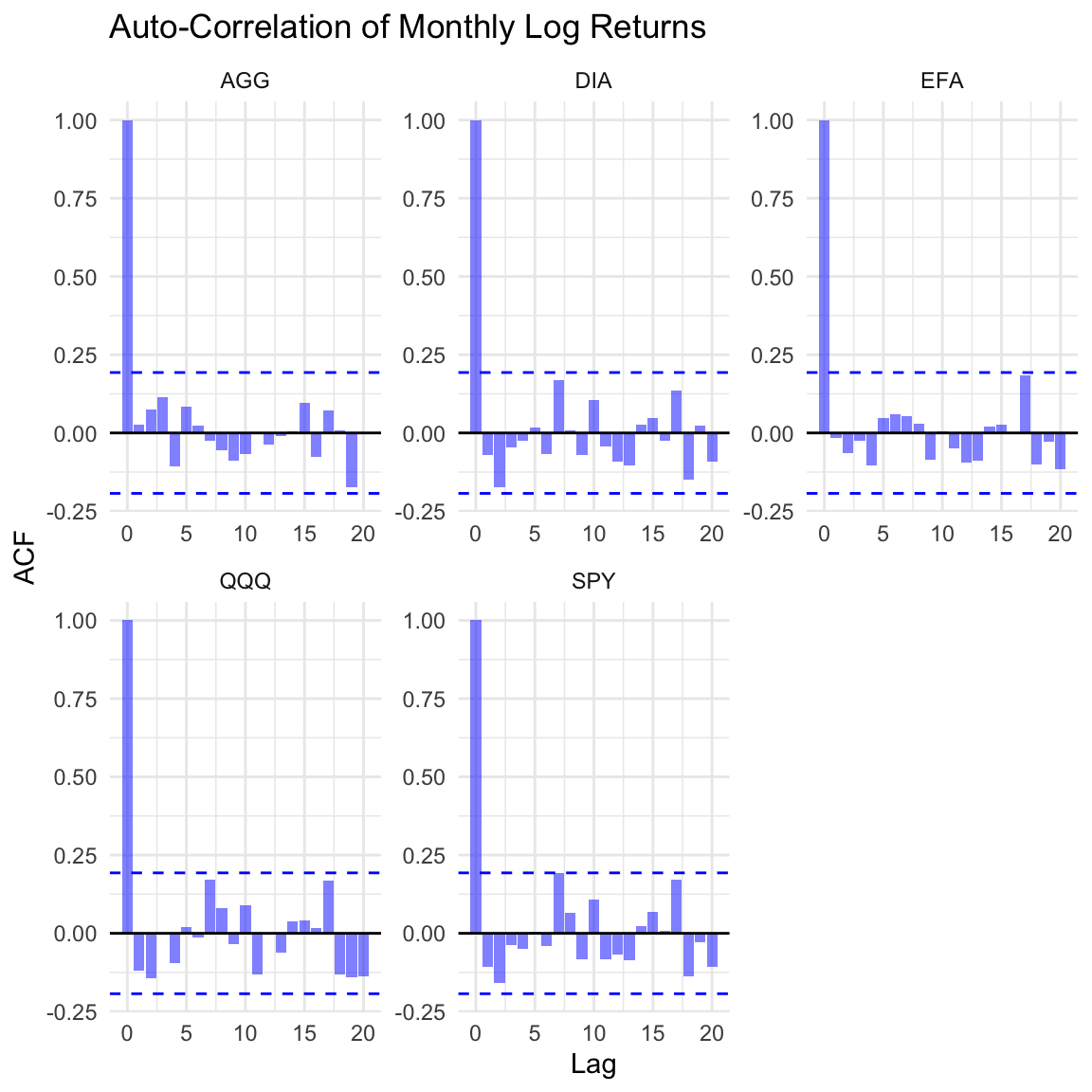
Other theoretical distributions—such as the log-normal, beta, and t-distributions—have been explored as alternatives. While these may work for specific samples, they often fall short, particularly when it comes to tail risk. A skewed distribution might fit one sample well, only to mislead us when applied to another. Consider the return series for the SPDR Dow Jones Industrial Average ETF (DIA). Let’s plot its skewness-kurtosis graph:
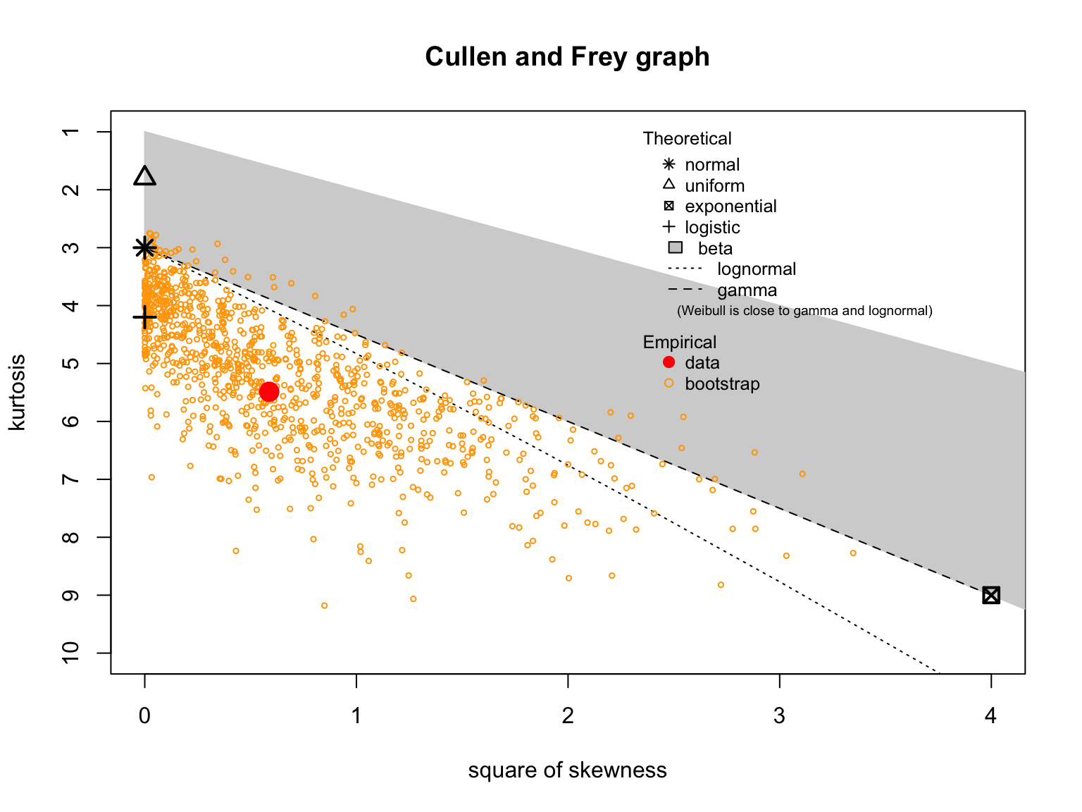
summary statistics
------
min:  -0.1464204   max:  0.1147056
median:  0.01368795
mean:  0.01137439
estimated sd:  0.0398583
estimated skewness:  -0.7669301
estimated kurtosis:  5.48787
Notice the blue dot (labeled observation) in the plot above. Does it suggest our sample of returns matches any theoretical distribution? The orange dots, representing bootstrapped samples, are scattered. With only one sample, it’s hard to trust any theoretical distribution for reliable inference.
For these reasons, I prefer to estimate probabilities empirically using the empirical distribution function (eCDF). The key advantage of this nonparametric method is that it relies directly on the data, unlike theoretical distributions that are based on normality assumptions which may not hold in practice. When parametric conditions are violated, the eCDF provides a flexible way to estimate probabilities from the data itself, while still retaining desirable asymptotic properties, as it often converges to normality in the limit. This makes it a robust approach for finite samples that deviate from theoretical assumptions.
Suppose that
Next, we order the batch of observations by
if
if
if
If there is a single observation with value
In the case where
where
By the definition of CDF, the probability of
In other words,
The stats package provides a function factory, ecdf, which returns an empirical cumulative distribution function (eCDF) given a vector of observations. This function allows us to estimate probabilities based on the observed data rather than assuming a theoretical distribution. This is particularly useful when the data, such as asset returns, do not follow well-known distributions like the normal distribution.
For example, we can create an empirical cumulative distribution function for the monthly log returns of the SPDR Dow Jones Industrial Average ETF (DIA). As noted in earlier sections, the distribution of these returns is neither normal nor matches any other common theoretical distribution.
# Create a function using the function factory
ecdf_DIA <- ecdf(x = asset_log_returns[["DIA"]])
Next, we may plot the eCDF using ggplot2:
# Plot data
tibble(
  x = asset_log_returns[["DIA"]],
  y = ecdf_DIA(v = asset_log_returns[["DIA"]])
) %>%
  # Plot using geom_step
  ggplot(data = ., mapping = aes(x = x, y = y)) +
  geom_step(color = "orange") +
  labs(
    title = "Empirical Cumulative Distribution",
    x = "Monthly Log Returns",
    y = latex2exp::TeX("$\\F_{n}(X)$")
  ) +
  theme(
    panel.grid = element_blank(),
    panel.background = element_rect(fill = "white")
  )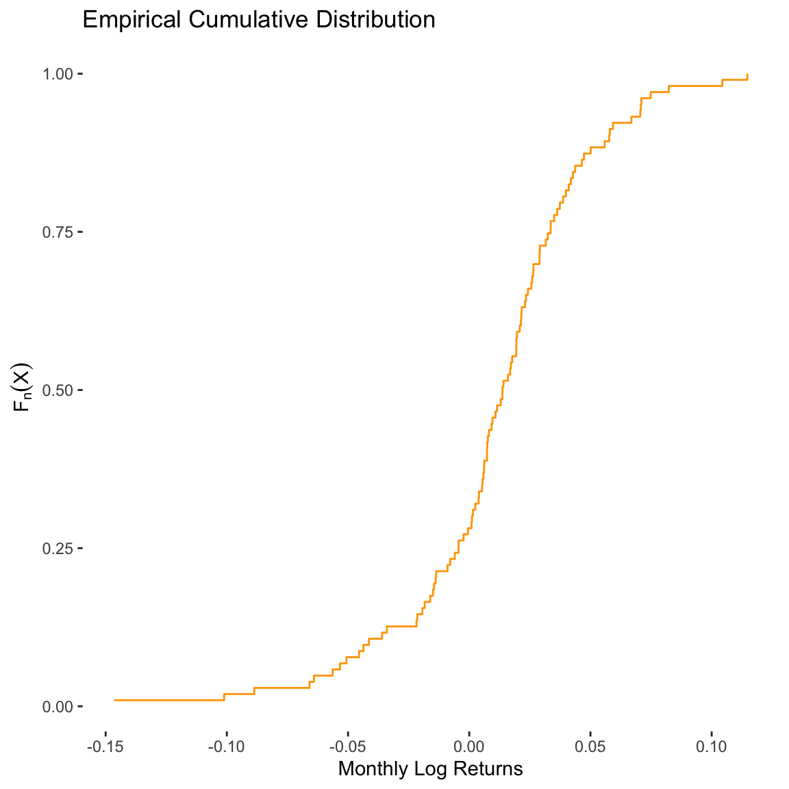
The advantage of using an eCDF is that we can compute empirical probabilities for various ranges of the data. For example, suppose we want to know the probability that a monthly log return is less than 0%. We can evaluate the eCDF at 0, which provides the cumulative probability up to that point:
# Probability P(x < 0.0)
ecdf_DIA(v = 0)
[1] 0.2815534In other words, there is about a
The eCDF provides an empirical estimate of the cumulative distribution function, which is particularly useful when the data do not follow any standard theoretical distribution.
Cumulative probability is the probability that a random variable takes on a value less than or equal to a given threshold.
For continuous variables like asset returns, the probability of observing any specific value is zero. We can only estimate probabilities for intervals of values.
The eCDF can be used to compute empirical probabilities, such as
While we’ve introduced a method for estimating probabilities of asset returns using an empirical approach, it’s important to recognize its limitations. Nonparametric estimation, especially for continuous distributions, typically requires a large amount of data to be reliable. In this post, we’ve used 103 monthly returns from 2012 to 2021. For greater accuracy, one could switch to higher-frequency data, such as weekly or daily returns, which can expand the sample size and improve the estimates.
However, there are still challenges. Interpolating between observed values (e.g., for different frequencies like yearly, weekly, or daily data) and extrapolating beyond the range of the observed returns (e.g., estimating probabilities for extreme returns) require assumptions that may introduce uncertainty. Additionally, while the empirical approach is useful in univariate analysis, it can become less reliable in multivariate settings, where data are more dispersed across higher dimensions.
It’s important to note that no single method for estimating probabilities of asset returns is flawless. In practice, analysts often focus on broader measures of risk and uncertainty, such as value-at-risk (VaR), expected shortfall, or downside deviation, rather than relying solely on probability estimates. While this post has introduced an empirical approach, other risk measures may be more appropriate depending on the context.